Dacia announced at the start of its strategic plan in 2021 that a new page in its history was being opened. It is taking shape today with the evolution of its image: a new logo, a new emblem, new colors, new territory… but without denying its origins. If the recipe for the brand’s success remains the same, it is under a new light that it presents itself to reaffirm its values of simplicity, authenticity and robustness, always at the right price.
Denis Le Vot, Chief Executive Officer, describes Dacia as “the brand that constantly redefines what is essential in the automotive industry. The brand that makes “accessible” rhyme with “attractive”. This positioning is still unique in the market and is set to be expanded in the years to come.
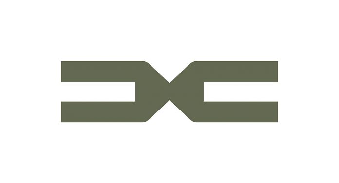
Dacia’s renewal is embodied in a new logo and a new emblem, symbols of a singular and assertive brand.
These two elements were designed in-house by the Design team, with the aim of expressing the essentiality of the brand, a foundation of Dacia since its origins.
The logotype, the central element of the new visual identity, inspires robustness and stability at first glance. The design of the letters is deliberately minimalist – the D is an inverted C – as if to visually embody the frugal and clever spirit of the brand. This geometric imprint of the logotype gives the sequence of letters a mechanically inspired movement.
The quintessence of the logo, the emblem represents the meeting of the D and the C, like two pieces that connect and assemble to form the link of a chain, symbol of solidity and link. A powerful graphic element, the emblem will make it easy to identify the brand even from a distance.
Simple and clear, the two strong elements are laid out as a matter of evidence, to serve as a confident reminder of the solidity of Dacia vehicles, everyday companions for millions of customers.
The entire graphic universe is deliberately uncluttered, to remind us that Dacia is a brand that focuses on the essentials. The different elements that make up the graphic universe bring coherence to the whole, while allowing for the creation of enriched digital content. In keeping with the general spirit of the brand, this graphic system is both robust and flexible. For example, the role of the arrow generated by the D in the logotype is to lead the eye towards the essential and to instill the movement of a brand resolutely turned towards the future.
DACIA GOES GREEN
The color palette, centered around a khaki green, evokes proximity to nature, a strong point of reference for our customers and a territory where Dacia vehicles exploit their full potential, like the iconic Duster.
Secondary colors complete the range: – more earthy colors: three “earthy” secondary colors – dark khaki, terracotta, sand – two other secondary colors – a bright orange and green – complete the range and bring a more technical touch.
The spirit of the brand is also embodied in a new iconographic approach, symbolizing the need for freedom, to recharge one’s batteries, to return to the essentials. These are widespread needs, pushing us to focus on what really matters and to detach ourselves from the superfluous. Dacia, Everything. Simply.


